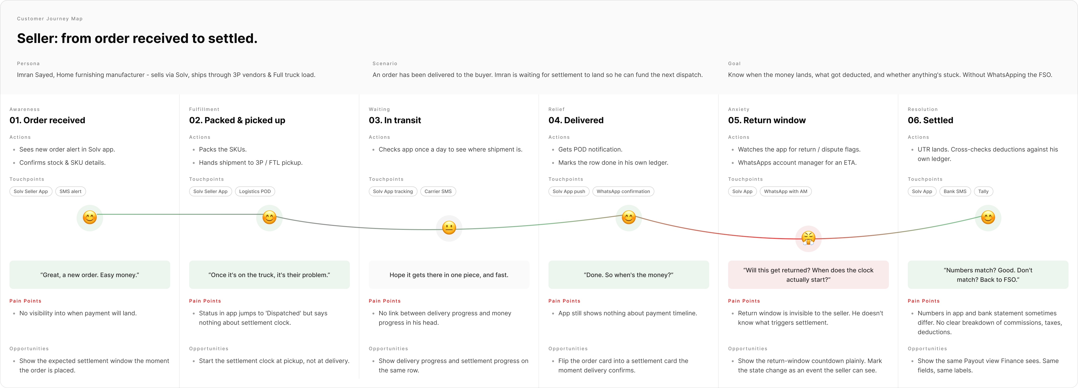
All case studies
Fintech Enterprise Multi-platform · 2024

MIS Financial Portal

Solv is a B2B commerce platform. Three teams were reconciling payments by downloading reports and switching between five different tools. I redesigned the system so finance, support, and sellers were all reading the same numbers, in the same place.

  • Role Lead Product Designer
  • Timeline 6 months · 2023
  • Team 1 designer · 4 PMs · 5 engineers
  • Impact 7→2 day settlements · −28% support tickets
MIS multi-screen composite showing Dashboard, Transaction View, UTR Approval, OMS and Seller Portal

MIS multi-screen composite — Dashboard, Transaction View, UTR Approval, OMS and Seller Portal

01 Context

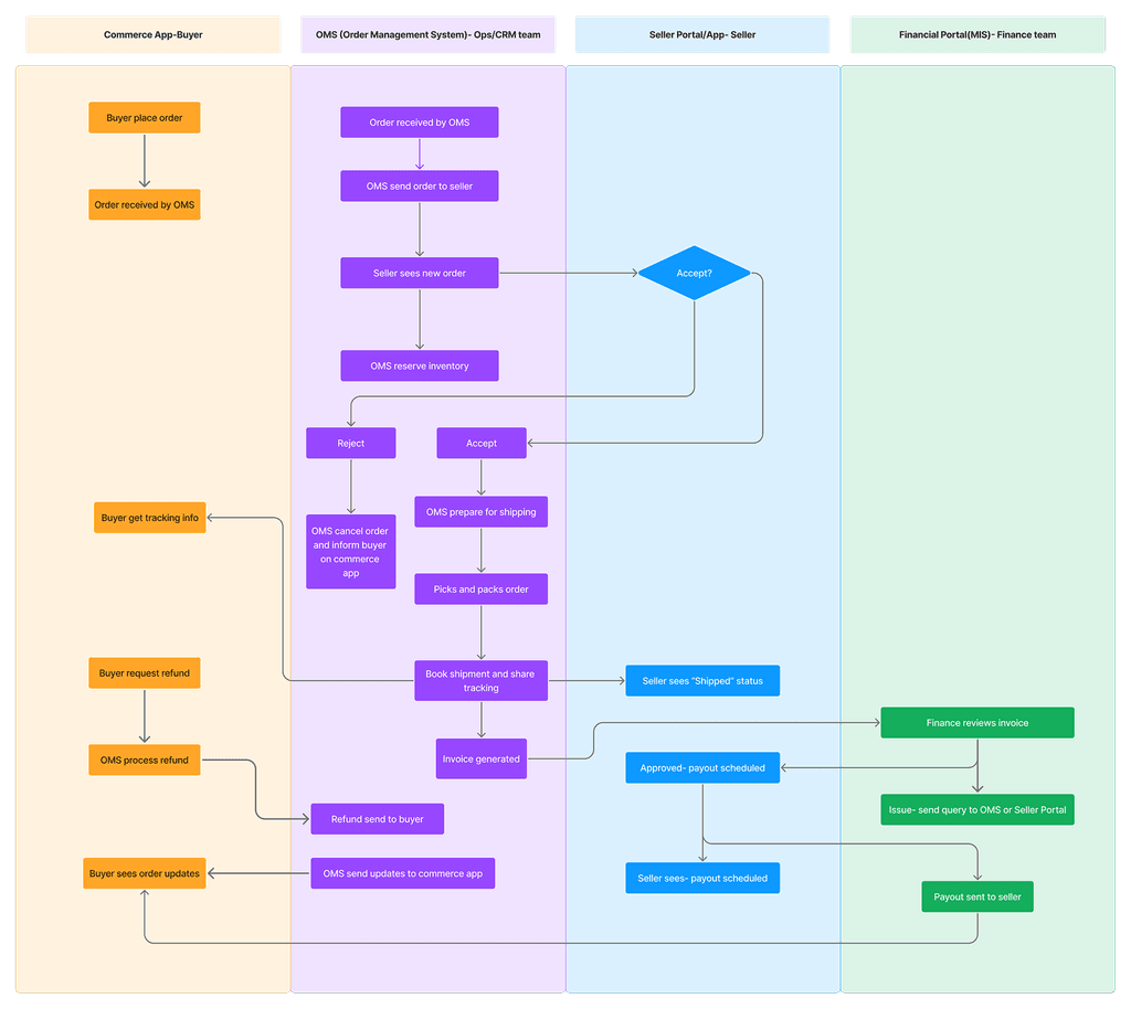
Money moved through seven partners. Nobody saw the whole picture.

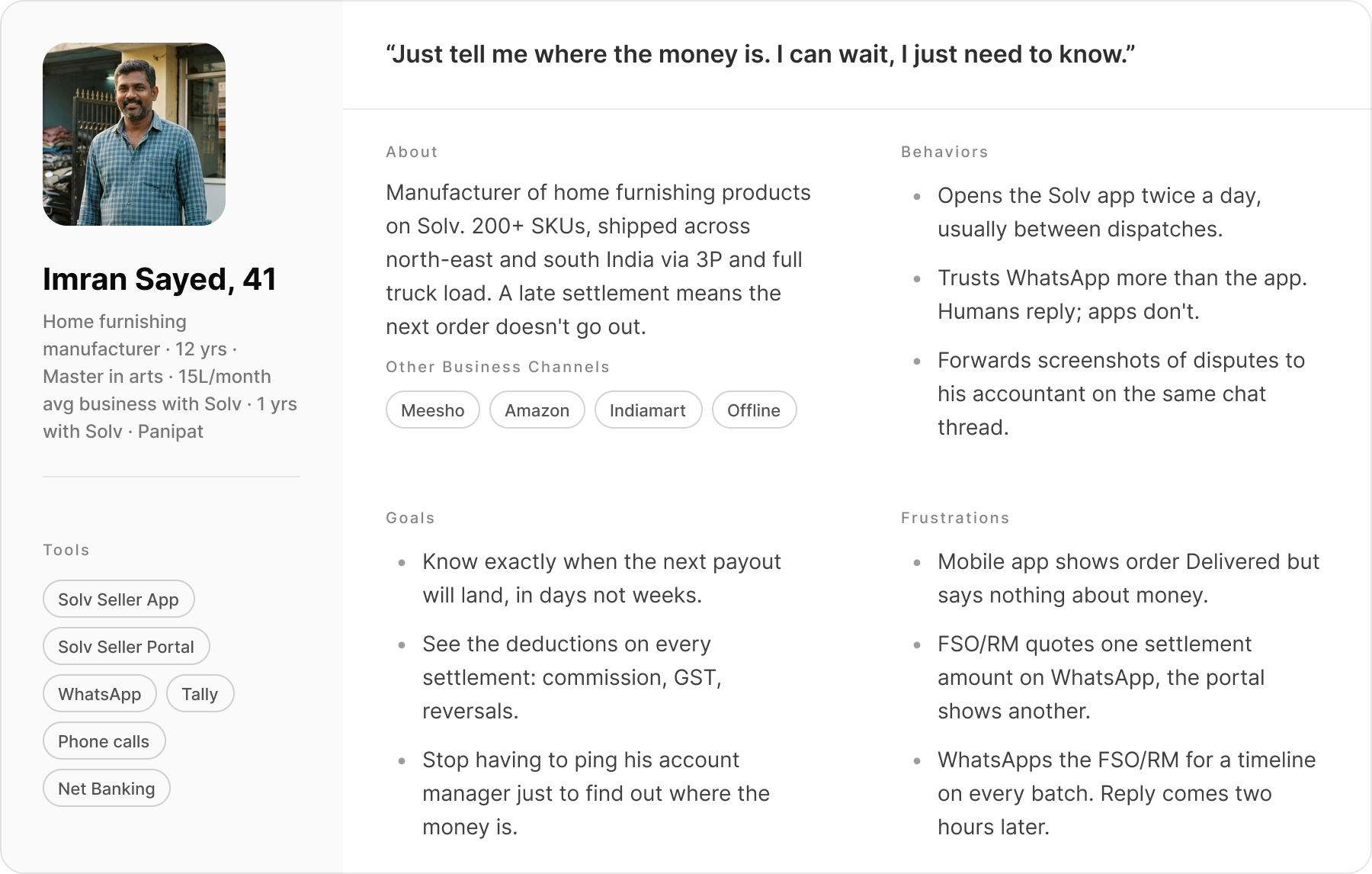
Solv is a B2B commerce platform — wholesale buyers placing orders, sellers fulfilling them. Money comes in through three payment partners (PayU, Rupifi, EPay Later — the last two are pay-later providers). Goods go out through four delivery partners (Delhivery, Bluedart, Ekart, Smartr), who sometimes also collect cash on delivery on Solv's behalf.

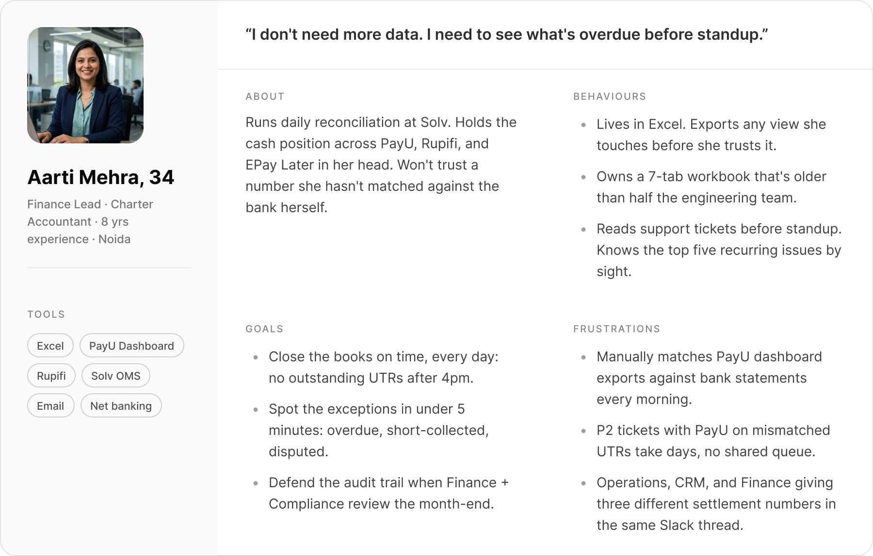
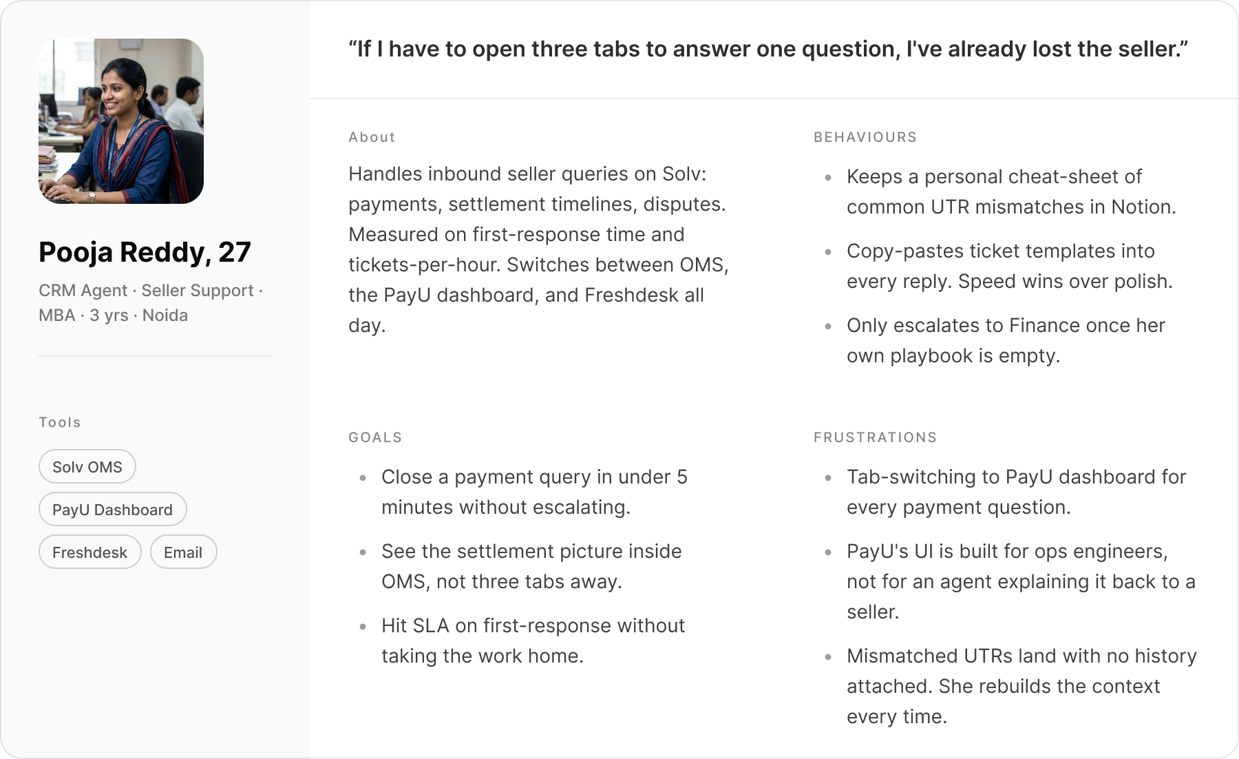
I joined as Lead Product Designer to redesign the financial layer: reconciliation, the transaction ledger, and what sellers actually see about their money. Three products were involved — the internal MIS portal (finance), OMS (operations and support), and the seller-facing app and web.

02 Problem

Three teams answering the same question with three different numbers.

Reconciliation lived outside the product. Every morning, finance, support, and sellers were each working from a different version of the same payment.

  • Finance was reconciling by hand. Someone downloaded the PayU settlement report from PayU's dashboard each morning and matched it against the bank statement, payment by payment. Rupifi worked the same way. EPay Later arrived by email as a spreadsheet.
  • When numbers didn't match, there was no real process. Finance had to log into PayU's dashboard, raise a ticket, and chase it through email. No record of any of it lived inside Solv.
  • Support agents were tab-switching for every seller question. The question came in through our order tool, but the answer was in PayU's dashboard. Ten to fifteen minutes of context-switching before a reply.
  • Sellers had no way to see where their money was. The app showed delivery status but said nothing about settlement. Most "where's my money" escalations went straight to account managers.
  • Solv was paying sellers out before the delivery partners collected the cash-on-delivery amount. It worked — the seller relationship depended on it — but internally, nobody could see how much money was floating across the four partners at any moment.

Product asked for a drill-down view and better seller visibility. Discovery turned that brief inside out. Reports were being matched against the bank by hand every morning, and the payment status of any one transaction kept shifting as goods moved. A drill-down on a static snapshot would have gone stale in weeks.

03 Design process

Six months. Five phases. The textbook order, bent where the project needed it.

Run as Agile sprints across design, product, and engineering.

  • 01 Discover Stakeholder interviews, observation sessions, transaction flow mapping
  • 02 Define Insight synthesis, problem reframing, design principles, scope alignment
  • 03 Ideate Wireframe explorations, data visualisation research, direction validation
  • 04 Prototype High-fidelity Figma screens, interactive prototype, executive UAT
  • 05 Deliver Annotated handoff, developer collaboration, post-launch tracking via MoEngage

04 Discover

I started with people, not data models.

I ran interviews with finance ops, CRM agents, and sellers — separately. Each group had a different experience of the same broken system and I didn't want one framing to bleed into another.

The most useful thing I did wasn't an interview. It was sitting next to a finance team member during morning reconciliation and watching. In 45 minutes I saw what no question would have surfaced:

  • Where she switched tabs (PayU dashboard → Excel → email).
  • Where she paused and double-checked a UTR against the bank statement.
  • Where she gave up and estimated.

Watching someone work around your product teaches you more than any question you can ask them.

One seller's workflow changed how I framed the problem.

I mapped a typical seller's journey on Solv: order received → packed → picked up by 3PL → delivered → settlement pending.

Sellers weren't asking "where's my money" out of impatience. The timeline was genuinely opaque at every stage. Transparency — even without faster payments — would solve most of the anxiety.

Seller journey map

Seller journey map — Order received, Packed, In transit, Delivered, Return window, Settled. Actions, thinking, pain points, and opportunities per stage.
Seller journey — order received → packed → in transit → delivered → return window → settled

Three roles, three different versions of "broken".

Personas

Aarti Mehra · Owns daily reconciliation across PayU, Rupifi, EPay Later.

  • Persona — Finance Ops Lead
  • Persona — Seller
  • Persona — CRM Agent
  • Finance team

    More data wasn't the problem. They needed the dashboard to lead with what was wrong — overdue, short-collected, disputed — across the three payment partners. Successful transactions were noise they were tired of scrolling past.

  • Support team

    Agents were flipping between two systems to answer every seller question — order details in one tool, payment details in another. Each query cost 10–15 minutes of tab-switching before they could even reply.

  • Sellers

    They couldn't see what stage their money was at. Orders moved from delivered → return window → settlement initiated → paid, but the seller never saw any of it. They wanted clarity more than they wanted speed.

05 Define

The brief asked for a drill-down. Discovery said scrap it.

After synthesis, I reframed the scope with the product team. The original ask was a drill-down. Discovery showed payment status was changing constantly as logistics moved — a static drill-down would be obsolete in weeks.

We aligned on three principles that would guide every decision:

  1. 01

    Lead with what needs attention

    The 20% of transactions that are overdue, short, or disputed get the front page. The 80% that are fine sit one click away.

  2. 02

    One number, three views

    Finance, support, and the seller are all looking at the same payment. The view changes — the underlying figure doesn't.

  3. 03

    Keep the systems in sync

    A status change in finance has to show up in the support tool and the seller app the moment it happens. If the numbers can disagree, they will.

One swimlane, four systems — the map design, PM, and engineering all built against.

The reframe needed something everyone could point at. I mapped the end-to-end order flow as a swimlane across Solv's core systems — Commerce, Seller, OMS, Finance — so design, product, and engineering shared one view of where money moved and where status changed.

SOLV order processing swimlane — end-to-end flow across Commerce, Seller, OMS, Finance
SOLV order processing — swimlane across Commerce, Seller, OMS, Finance

Every transaction moves through the same states. We mapped them before drawing a screen.

Underneath the order flow, every transaction moved through the same payment lifecycle — success, retries, chargebacks, refunds, across advance and balance payments. I mapped this before designing any screen so the team shared one view of which states could transition into which.

Transaction process flow — success, retries, chargebacks, refunds across advance and balance payments
Transaction process — success, retries, chargebacks, refunds across advance and balance payments

06 Ideate

Two things were broken: what the screen led with, and how the numbers rendered.

We led with everything. Finance only cared about what was wrong.

Our initial wireframes showed everything at equal weight. Every transaction, every vendor, equal pixel real estate. We took it to a usability test with two finance team members.

"I don't need to see successful payments every morning. I need to see what's overdue." — Finance team member, usability test session

That sentence rebuilt the dashboard. The new version led with what was wrong — overdue, on-time, short-collected — and pushed the rest one click down.

Wireframe V1 vs V2 — flat hierarchy vs status-first architecture with drill-down

Wireframe V1 vs V2 — flat hierarchy vs status-first architecture with drill-down

₹5,000 and ₹5 crore in the same chart — impossible on a linear scale.

A single dashboard view had to render five payment streams in one chart:

  • PayU card and invoice payments — anywhere from ₹5,000 to ₹50 lakh per transaction
  • Rupifi pay-later settlements
  • EPay Later pay-later settlements
  • Cash-on-delivery batches from the four logistics partners — up to ₹5 crore each

On a regular linear scale the ₹5,000 transactions vanished next to the ₹5 crore ones. Customising the charting library wasn't on the table — it was a third-party tool with limited config.

So I went looking for how other enterprise products handle this and ended up in IBM's documentation on logarithmic scales for data-heavy charts.

IBM Docs — Logarithmic axes ibm.com/docs/en/gddm?topic=axes-logarithmic

I pulled a month of real transaction data and built a quick prototype in a code editor — log vs linear, side by side, using the actual values. The log scale made ₹5K and ₹5Cr readable in the same chart.

I brought it to a working session with the dev and PM. Not a deck, just a browser tab with real data. We agreed on the approach in that room. Going slightly outside the design brief into a technical problem saved weeks of back-and-forth.

07 Prototype

A senior exec rejected the prototype — until we added Excel back in.

We built a Figma prototype covering the core Finance flows: dashboard, transaction view, UTR approval, payout. Usability testing with finance and internal stakeholders mostly confirmed direction. One session stopped the project in its tracks.

A senior finance executive reviewed the prototype and didn't want to move to the new system. Not because it was broken — but because it was unfamiliar.

He had been working in Excel for years. Our dashboard deliberately led with exceptions and vendor performance. Excel showed everything, always. Side by side, ours looked like it was hiding things — even though it wasn't.

The question for the team wasn't "how do we convince him." It was "what is he actually losing that we haven't accounted for?" The answer was control — Excel let him filter, sort, and export exactly the way he wanted.

We didn't change the design. We added a capability the design was missing.

We added import and export — Excel out for control, Excel back in for bulk updates. The executive adopted the platform. In the next phase, export management became a standalone feature that Operations and CRM actively asked for. A resistance fix turned into a cross-team feature.

Settlement Upload — bulk Excel import / export that became a cross-team feature

Settlement Upload — the Excel bridge that became a cross-team feature

08 Solution

Seven views of the same money, each shaped around a different job.

Five views inside the internal tools, two on the seller side. The underlying numbers are the same in every one; what changes is what gets put in front of you.

Finance — Dashboard

The dashboard leads with what's wrong.

Collection status sits up top — overdue, on-time, short-collected — broken down by each of the three payment partners. The bar charts use a logarithmic scale so a ₹5,000 transaction and a ₹5 crore one are both legible in the same view (a fix that took me a side-quest into IBM's data-viz docs).

MIS Dashboard — status-first layout with vendor performance and log-scale data visualisation
Finance — Transaction view

Every transaction, one ledger.

A filterable table of every transaction. Click a transaction ID and the row expands into a timeline of how that payment moved — captured, received, refunded, charged back, reversed. Same states the rest of the system uses. Export to Excel sits in the header for the people who still need it there.

Transaction view with expandable timeline row — full audit trail inline
Finance — Bank approvals

Approve a bank transfer with the breakdown visible.

When PayU sends Solv a bank transfer, finance has to confirm the amount matches what's owed. The approval screen shows the transaction-level breakdown side by side with the bank reference. Rejections need a written reason — the same note becomes the ticket finance raises with PayU when amounts don't line up.

UTR approval flow — confirmation modal with transaction breakdown and mandatory rejection reason
Finance — Seller payouts

What we paid the seller, line by line.

One row per payout: amount, bank reference, status. Expanding the row shows the deductions — commissions, taxes, returns, recoveries — and the breakdown matches exactly what the seller sees in their app. No reconciliation calls about "why is your number different from mine".

Payout view — settlement rows with expandable deduction breakdown
Support tool

Payment context inside the support tool.

The full payment lifecycle now lives inside the order view that support agents already had open — payment method, settlement status, bank references. Tab-switching to PayU went away. Reply times that were measured in hours dropped to minutes.

OMS order detail view with embedded payment lifecycle — no tab switching required
Seller — Settlement status

Sellers see what stage their money is at.

Once an order is delivered, the timeline becomes visible: return window → settlement initiated → settled. Same words finance uses internally, so when a seller calls support, both sides are reading the same screen.

Seller Portal settlement status — web
Web
Seller App settlement status — mobile
Mobile app
Seller — Payment summary

Net earnings, with the maths shown.

Total payouts, bank reference, commissions, taxes, deductions, recoveries. Every figure ties back to the same row finance is looking at — no parallel spreadsheet, no version-control fight over which number is right.

Seller Portal payment summary — web
Web
Seller App payment summary — mobile
Mobile app

09 Outcomes & reflection

Settlements went from 7 days to 2. Support tickets dropped 28%.

Three months post-launch I pulled data from Operations, CRM, and Finance. For behavioural patterns and adoption, I used MoEngage.

  • 28%

    reduction in payment-related support tickets

    Source: CRM team

  • 7→2 days

    average vendor settlement processing time

    Source: Finance team

  • 30% faster

    daily reconciliation — same tasks, less time

    Source: Finance team

  • 10→4 days

    average seller payout time

    Source: Operations team

  • Minutes

    to resolve payment disputes — down from hours

    Source: CRM team

  • 3 teams

    adopted export management feature in Phase 2

    Source: MoEngage

Beyond the numbers: ops stopped emailing spreadsheets to finance, and sellers stopped escalating to account managers. The conversation between teams shifted from arguing about figures to deciding what to do about them.

Three things I'd do differently. One I'd always keep.

Bring sellers into discovery earlier. We spent most of the research time on the vocal internal stakeholders. Seller insights came late and turned out to be just as load-bearing.

Don't underestimate UAT. I went in thinking it was sign-off. It turned out to be the most valuable feedback loop of the project — the Excel export feature came directly out of UAT resistance, not earlier research.

Document decisions in real time, not at the end. The log-scale call, the hierarchy rebuild, the export origin — I had to reconstruct all of it from memory later. Handoff and this case study would both be sharper if I hadn't.

The thing I'd always keep: mapping the full transaction lifecycle as a swimlane before designing anything. It sounds like overhead. It prevented at least three major scope disagreements and became the one document everyone — design, product, engineering — referenced throughout.

How did this land

React without an account.

Got more to say? Send a note →

Working on something similar

Want to talk about it?

If you're working on reconciliation, ops UX, or enterprise design systems, I'm happy to think through scope before you commit.