All case studies
Healthcare Enterprise AI-assisted · 2023

Predicare

A US health insurer wanted to retire a case-management system built in the early 2000s. I joined the design team as a junior product designer and owned the personas, current/future workflows, wireframes, and the interactive prototype — all under the lead designer's review.

  • Role Product Designer (Junior)
  • Timeline 12 weeks · Nov 2022 – Jan 2023
  • Team 2 designers · 2 developers · Architect · PM · BA · SME
  • Impact 40% non-clinical tasks automated · 23% ↓ medical costs
Predicare case dashboard preview

Predicare composite — dashboard, member detail, predictive analysis, care plan

01 Overview

Replacing a 20-year-old case-management system used by nurses at a US health insurer.

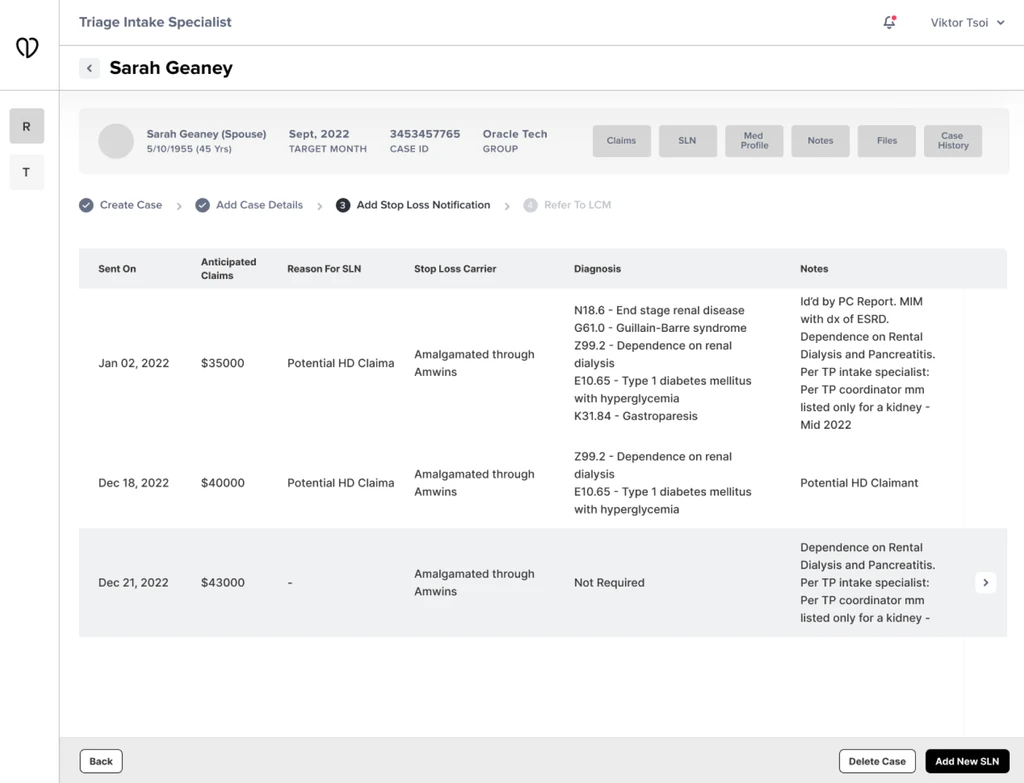
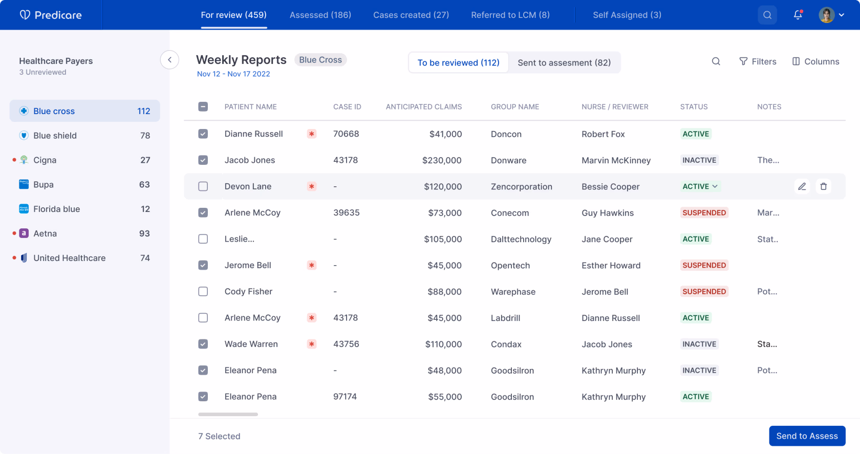
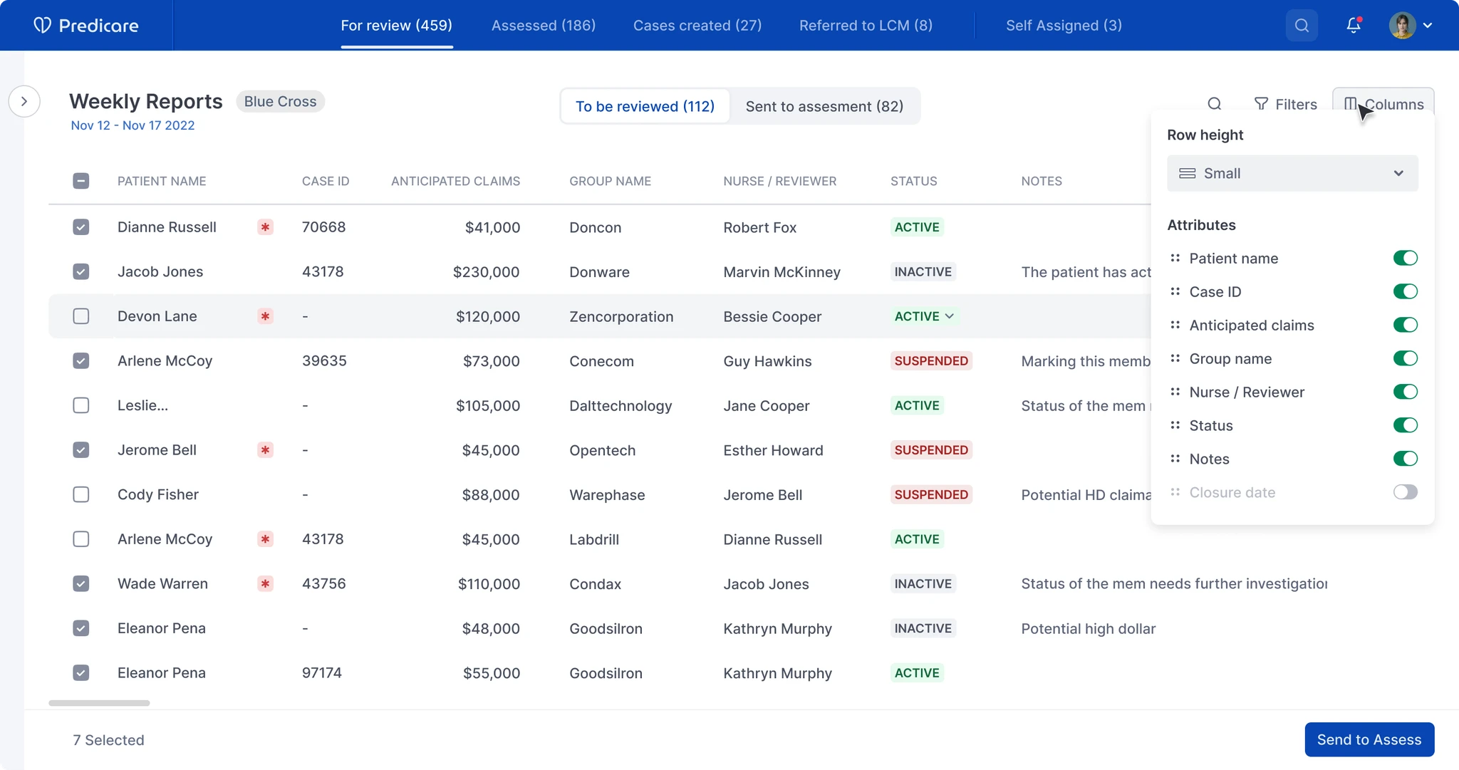
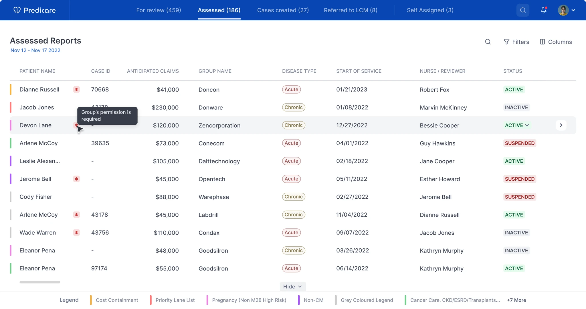
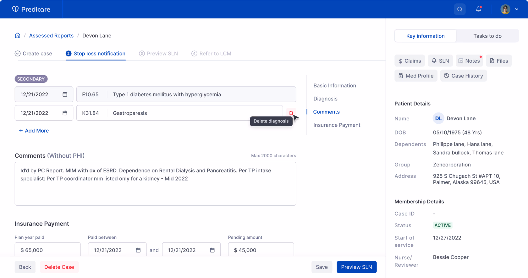
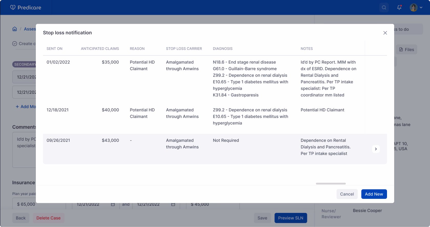
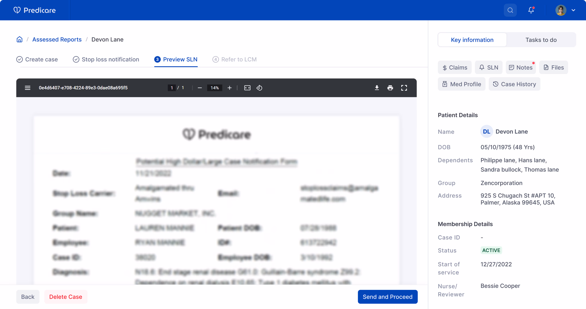
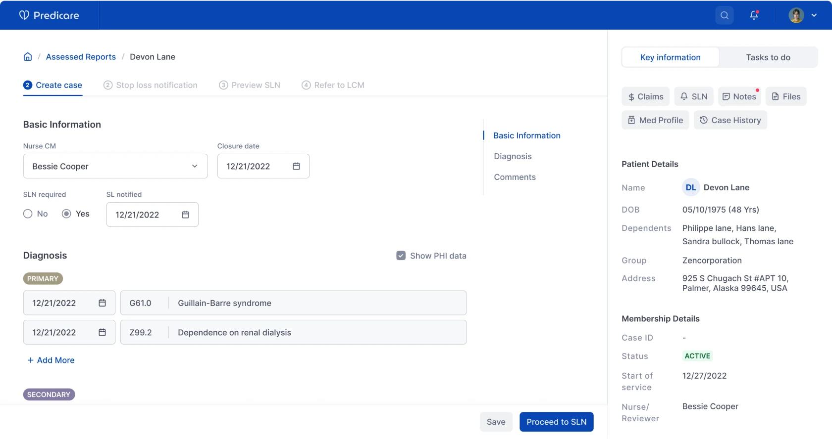
Predicare is a platform US health insurers use to help their back-office nurses catch serious health issues in members early — before the member ends up back in hospital. AI sits in the background doing two jobs: managing the health-plan paperwork, and flagging claims that look fraudulent.

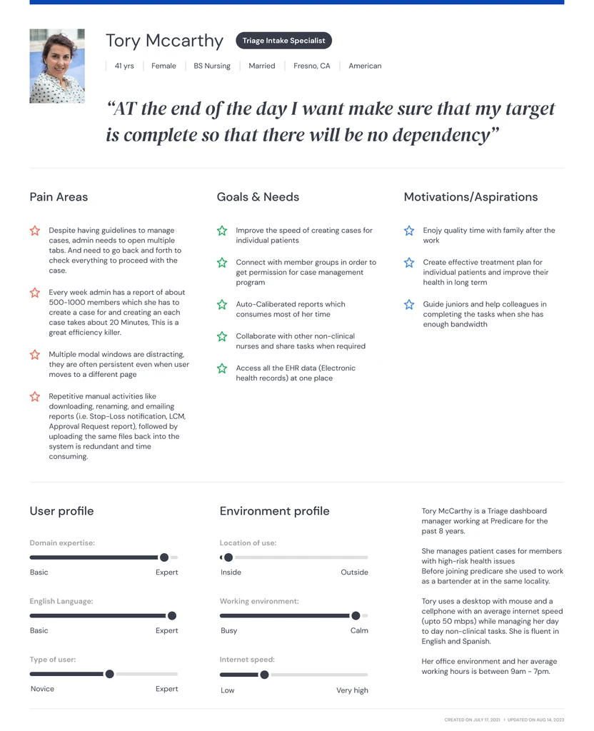
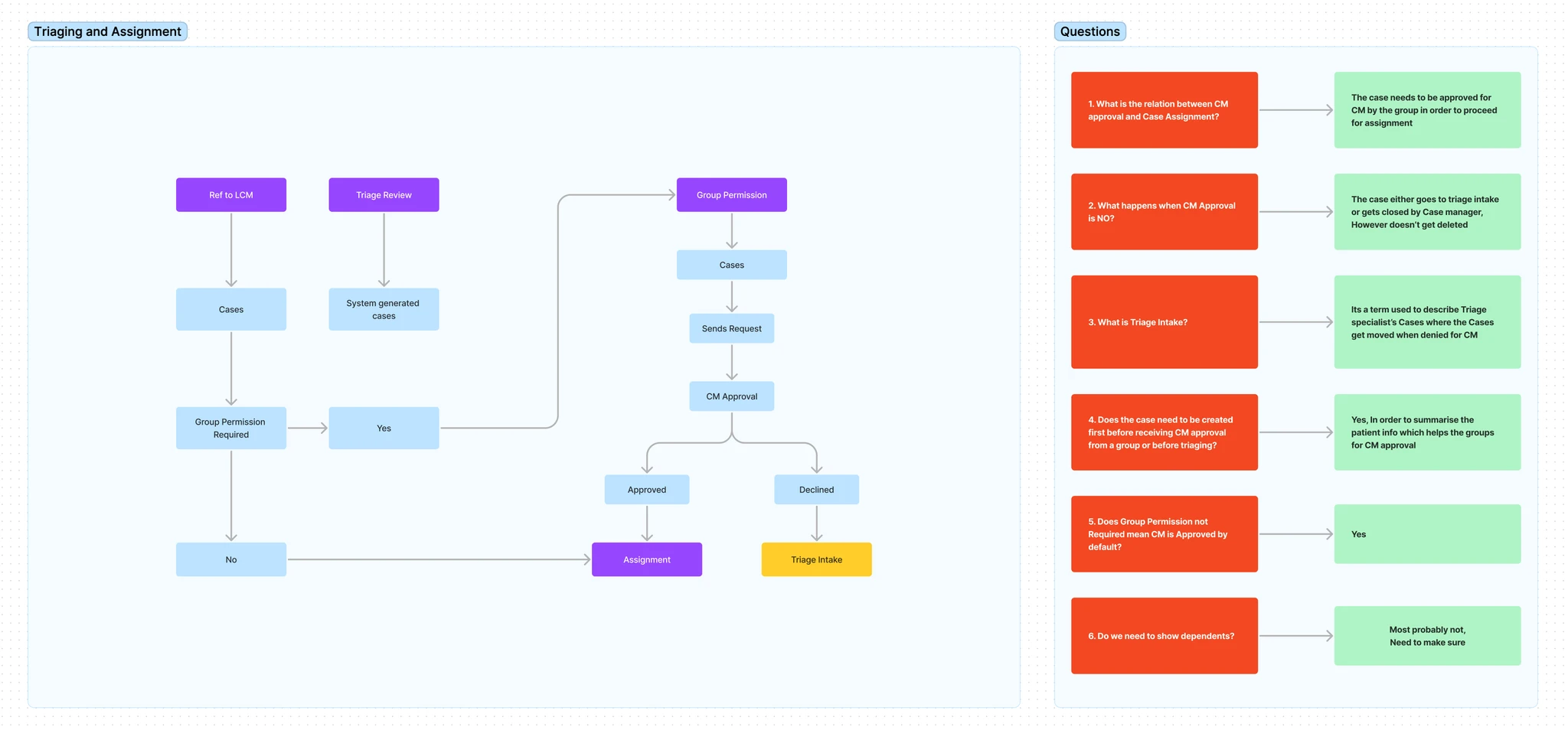
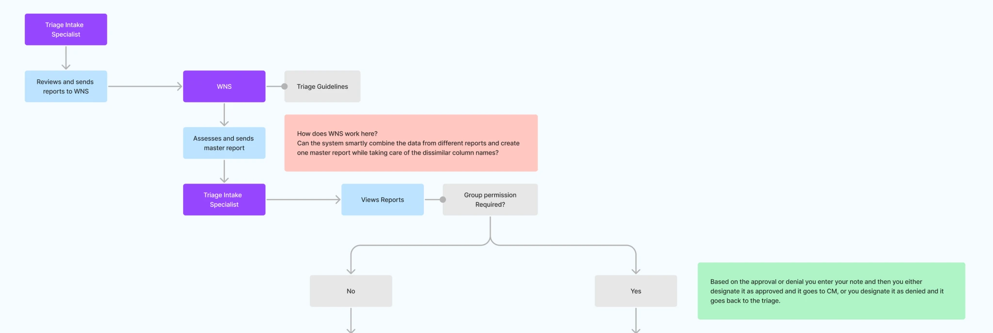
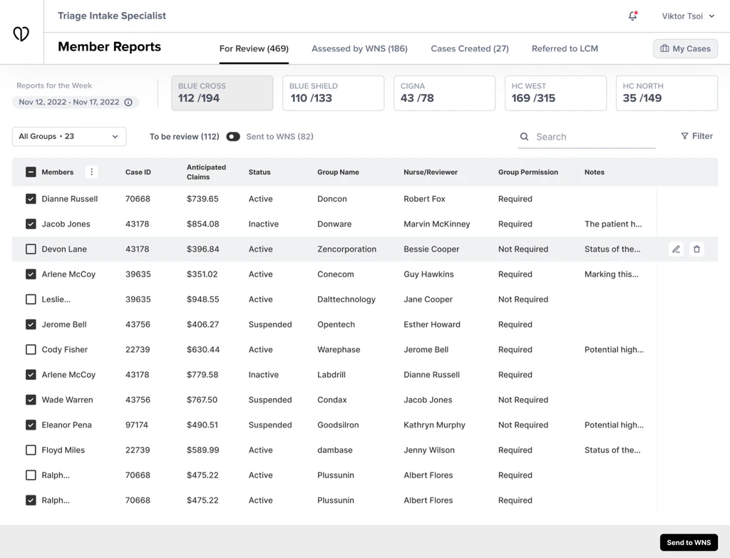
Three designers were working on the rebuild of the original system, which had been built in the early 2000s. This case study covers the bit I owned: the workflow nurses use to open and run a patient case.

02 Problem

Nurses spent most of their day copy-pasting between tabs, not on patient care.

The product helps the insurer save money in a few ways — keeping discharged members from re-admitting, reviewing and negotiating claims, and prompting nurses to follow up with the right members. The idea was good. The day-to-day inside the app was not.

There was no real way for the team to work on a case together, and the case-management process was held together with manual steps. Nurses were spending most of their day on the non-clinical bits — admin, lookups, copy-paste — instead of actual patient work.

03 My role

I owned personas, workflows, wireframes, and the prototype — reviewed by a senior lead.

I joined the project as a product designer on a four-person design pod led by Akash Raje. My remit was specific and end-to-end: drive the user-facing research outputs and convert them into shippable design.

  • Built the personas out of the contextual interviews — back-office nurse, case manager, claims reviewer — with each one's goals, frustrations, and the actual tasks they did inside the legacy app.
  • Mapped the current workflow to make the pain visible, then drafted what the new one should look like — data pulling itself together, the system surfacing care gaps before the nurse had to look for them, and the team able to work on a case together.
  • Wireframes across the core screens, four rounds, reviewed with the client's clinical experts, the business analyst, and the system architect before anything got locked.
  • Built the clickable Figma prototype with real data so the client could walk the whole workflow before engineering opened a ticket.

Akash led the engagement — overall design direction, client-facing reviews, visual language calls. I brought him into each milestone for critique, picked up where my craft was thin, and pushed back when I had reason to. The shape of the design is mine; the bar it had to clear was his.

Working under a strong lead, what you actually get is someone who'll tell you when your reasoning is the part that needs more work.

04 Design process

Twelve weeks. Five phases.

Twelve weeks on the clock. The business analyst and I split it into five phases — interviews, task analysis, ideation workshops, reviews with the clinical experts, and the hi-fi build.

  • 01 User interviews Structured interviews with nurses, case managers, and claims reviewers
  • 02 Task analysis Detailed walkthroughs of the existing case management workflow
  • 03 Ideation workshops Joint sessions with the BA, SMEs, architect, and developers
  • 04 SME reviews Wireframe rounds reviewed with partners before sign-off
  • 05 Hi-fi design Visual system established, then extended across the remaining screens

05 User research

HIPAA blocked me from touching the app, so I sat next to nurses instead.

I wanted to see what the nurses actually did each day, what got in their way, and where the system was helping versus hindering. A short discussion guide per role made the conversations easier — people had something to push back against, which is often when the real pain points show up.

The catch was that I couldn't open the app myself — US patient-privacy law (HIPAA) didn't permit it. So instead of clicking through, I sat with people while they did their work and wrote down what they did, why, and where they paused. The notes from those sessions became the shared reference the whole team built against.

User research

Discussion guide built per role — what to ask nurses, case managers, and claims reviewers.

  • User research questions — discussion guide by role
  • Contextual interview session
  • Workflow mapping — legacy case management process

Analysis

I wrote up the interviews into short reports — what we found, what was working, what wasn't, what we'd recommend. Those, alongside the personas, were what we kept pointing back to whenever a design call needed defending.

Research analysis — synthesised findings across roles
Personas — back-office nurse, case manager, claims reviewer

Key insights

  • The system worked. It just made everything slow. Nurses weren't fighting bugs; they were fighting click counts.
  • The interface looked twenty years old, and people felt it. The thing they kept asking for was a product that looked like it belonged in this decade.
  • Most of the daily work was busywork — copying data from one tab to another to answer one question.

06 Define

We rewrote the workflow before drawing a single screen.

I ran workshops with the business analyst, the system architect, and the data team to rewrite the workflows so the manual parts dropped out. For instance, the case-creation form used to be a copy-paste exercise — we replaced that with the system pulling the data in itself, then using predictive analysis to suggest the care plan instead of waiting for the nurse to assemble it.

I spent a lot of time with the architect and engineers to understand what was actually buildable and where the system would push back. Most of the good design calls came out of those conversations, not the design reviews.

  • Case creation process — ideation sketches
  • Case creation process — final flow

07 Ideation

Wireframes were where the argument happened.

Once the workflows were locked, I built a clickable wireframe with real data so the client could feel the experience instead of imagining it. The wireframes did most of the heavy lifting in the reviews — by round four the major calls had been made, and we moved into the high-fidelity build.

  • Wireframe iterations — case detail consolidation and predictive surface evolution across rounds
  • Wireframe iterations — additional surfaces

For the visual side, I looked at a handful of well-designed enterprise products to find a starting language. Two of the busiest screens became the place where the design system was set — and the rest of the screens built on that base as we went.

08 Key solutions

Auto-pulled patient data. Shared case surface. Predictive care plans.

  • Key solution — review
  • Key solution — review expand and dropdown
  • Key solution — assessing report

Pulled patient data from the different external systems automatically, reconciled it, and rolled it up into one master report — so the nurse wasn't doing the assembly by hand any more.

Patient information screen — consolidated member profile

Made case assignment and patient information a shared surface, so anyone reviewing the case could see what their colleagues had already done and pick up the thread quickly.

  • Key solution — patient information EHR
  • Key solution — patient information modal notification
  • Key solution — patient report preview

Used predictive analysis on the patient's health record (EHR) to flag care gaps and suggest a tailored care plan, instead of waiting for the nurse to spot the pattern.

09 Impact

40% of routine work automated. 23% drop in allowed medical costs.

  • 40%

    of non-clinical routine tasks automated, with end-to-end HIPAA compliance

    Source: Client analytics

  • ~14%

    cost reduction for high-cost claimants through plan refinements

    Source: Client analytics

  • 23%

    reduction in allowed medical costs through claim reviews for medical necessity

    Source: Client analytics

After we handed off, the client's parent company took the second phase of the build in-house.

Three things I'd do differently. One I'd always keep.

Run interviews in person where possible. Remote sessions worked, but video made nurses self-conscious about what they showed on screen — and that's exactly the data we needed.

Bring the lead into the framing earlier. I waited until I had something to show before pulling Akash in. Some of my early framing would have shifted in a five-minute conversation rather than a two-day rework.

Document the small calls. The reason a flow went one way over another lived in my head. Reconstructing it later for handoff was painful — and avoidable.

What I'd always keep: owning the deliverable end-to-end, even with a strong lead in the room. Reviews get you to better. Ownership gets you to ready.

How did this land

React without an account.

Got more to say? Send a note →

Working on something similar

Want to talk about it?

If you're working on enterprise UX, healthcare workflows, or legacy-system rebuilds, I'm happy to think through scope before you commit.